Logos Society
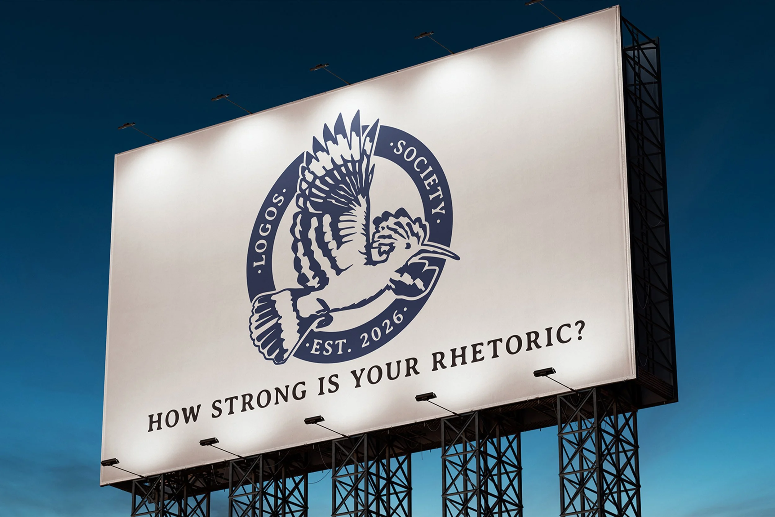
Logos Society is a debate and conversation space, focusing on the strength of rhetoric.
This identity was created through a lot of research and experimentation. Beginning with looking into the history of ethos, logos and pathos, the founding three elements of Logos Society.
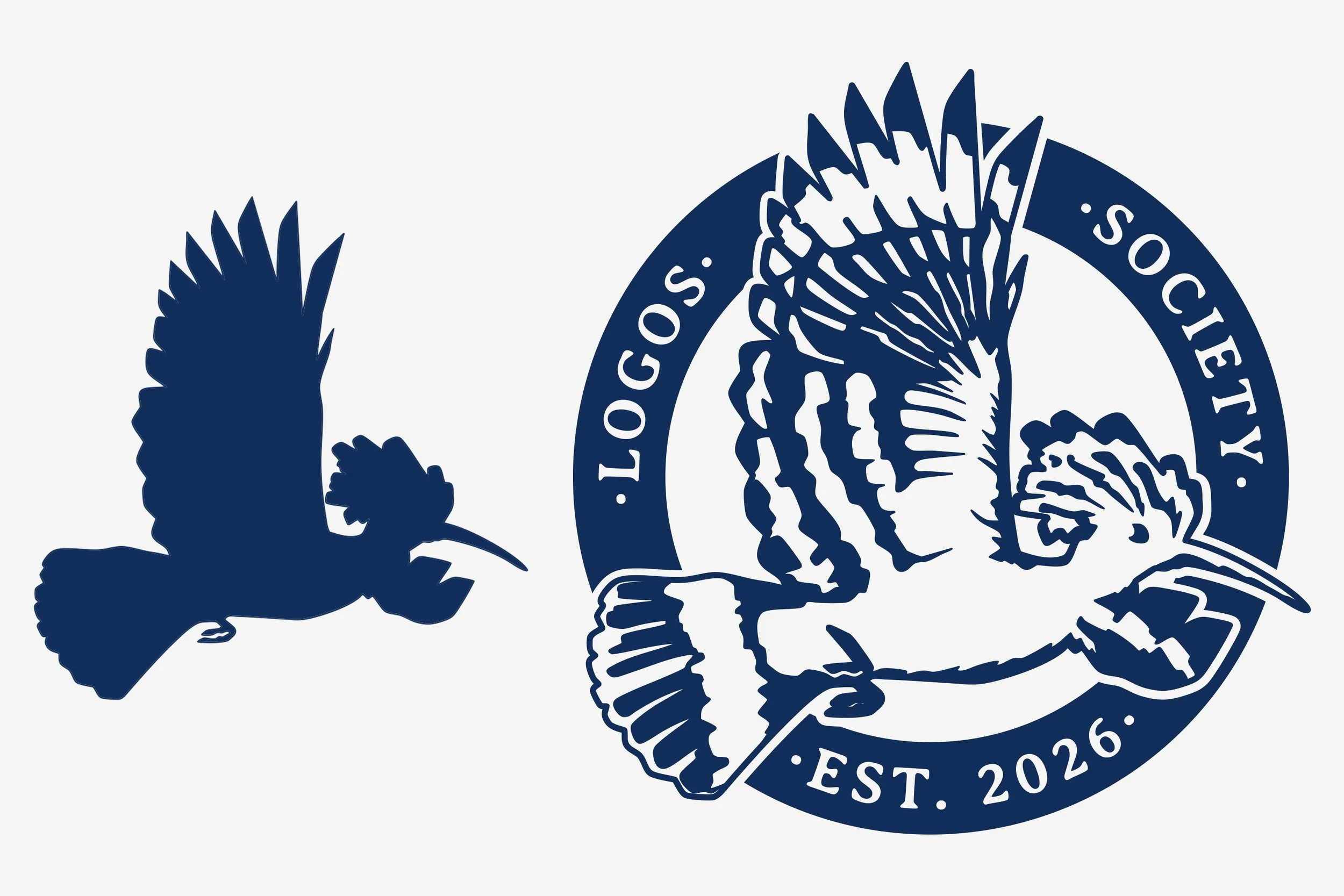
Through understanding the values of the founder and creator of this society, while mixing in elements of their heritage and religion; we settled on the identity being built around the Hoopoe (Hud Hud), which has Qur’anic reference and significance. This bird symbolises verification, reporting, truth-testing & message discipline. These traits are a perfect fit as it aligns with what the Logos Society represents and will be centred around.
After this, a process of illustrating the bird in a way that would work alone and also paired with text took a few rounds; but the stencil styled silhouette combination came out well. Pairing with text was much easier once this stage was competed and then it was just about finding the balance of image and text for the logo.
This was a part of the project that was easier, as the ideas and moodboard had many examples of old stamps and coins, so using that as a base for reference made things wrap up smoothly.
Service: Branding
Logos Society
Logos Society is a debate and conversation space, focusing on the strength of rhetoric.
This identity was created through a lot of research and experimentation. Beginning with looking into the history of ethos, logos and pathos, the founding three elements of Logos Society.
Through understanding the values of the founder and creator of this society, while mixing in elements of their heritage and religion; we settled on the identity being built around the Hoopoe (Hud Hud), which has Qur’anic reference and significance. This bird symbolises verification, reporting, truth-testing & message discipline. These traits are a perfect fit as it aligns with what the Logos Society represents and will be centred around.
After this, a process of illustrating the bird in a way that would work alone and also paired with text took a few rounds; but the stencil styled silhouette combination came out well. Pairing with text was much easier once this stage was competed and then it was just about finding the balance of image and text for the logo.
This was a part of the project that was easier, as the ideas and moodboard had many examples of old stamps and coins, so using that as a base for reference made things wrap up smoothly.
Service: Branding
Brand Identity
Brand Identity